Museum
This museum is designed to store and exhibit the work of a single artist, Richard Diebenkorn
How do we view art?
The building is designed with a strong prescribed itinerary of art viewing in which each gallery builds on the previous. The sheer scale of the paintings (ranging from 6-8 ft in height) demands a specific strategy for viewing. In order to see the full composition one must view from afar but Diebenkorn’s work transforms as the viewer gets closer, revealing the layers and complex subtlety of the brush strokes.
This means the work requires two distinct viewing experiences: up close and afar. The museum satisfies this need by puncturing the galleries to create visual thresholds and connections between each space.
The strong contrast between the gallery walls and the art walls helps to build the layered reading of space while providing a textured relief from the purity of the typical white gallery wall.
Circulation
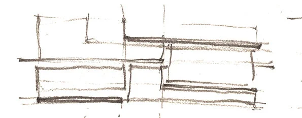
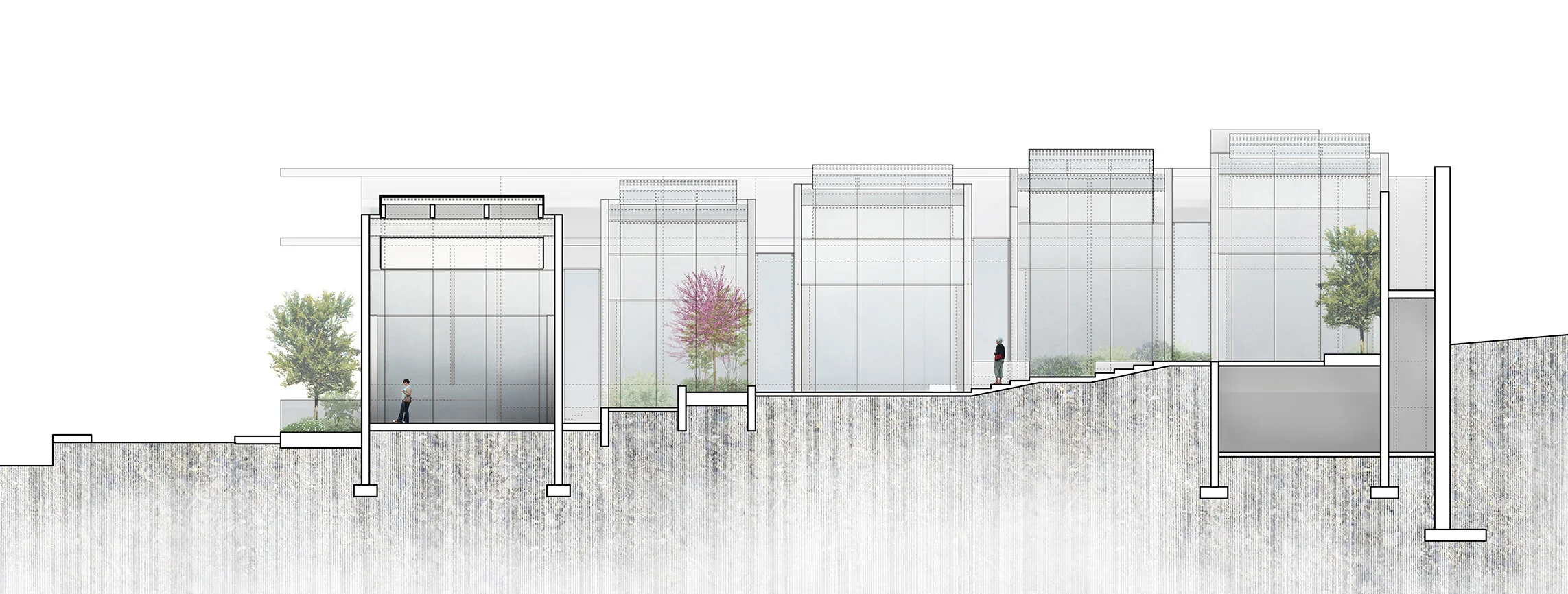
The itinerary begins at the top of the site and each gallery steps down in section through a series of thickened thresholds that house stairs and ramps. This elongated ramp procession allows the occupant to take a break from art viewing and partially or fully exit the building into the garden through an interstitial space.
The garden acts as the unifying thread between the gallery spaces and the support spaces. The sequence terminates at the museum cafe, which is nested within the garden.
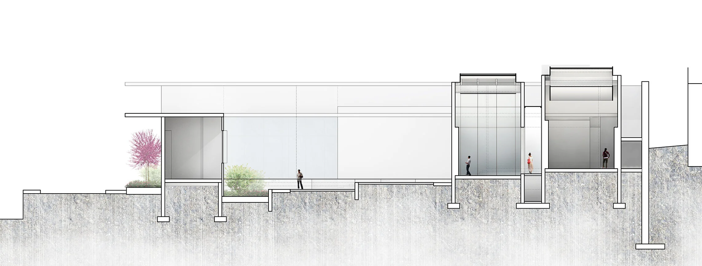
Section 01
Section 02
Section 03
Museum in a garden
The garden spaces are integrated into each gallery space using visual and physical connections. The west side is the urban garden, featuring a more hardscape approach while the east garden (above) is more traditional, acting as a plaza and landscape relief
longitudinal section
Luminous roof
The galleries are situated in an east/west orientation and are lit by a luminous ceiling outfitted with a series of skylights. The skylights run north/south in order to harvest and bounce the transforming east/west light. The overhangs at each end are elongated to prevent early morning and late afternoon sun from entering the galleries.
The curved geometry of the roof fins bend and smooth the incoming filtered sunlight. The second filter, perforated aluminum skrim, further scatters the light to wash the space with a tempered and even effect.
In response to the sloping conditions of the site, the galleries step down so that the roofs wont cast shadows on each other.
The heavy loads of the roof assembly are transferred to the concrete shear walls, which act as the structure and also house the HVAC system.


